
Clarity — Design Vision
Design Strategy & Long-Term CMF Direction
CMF Lead — Design Strategy / 2017
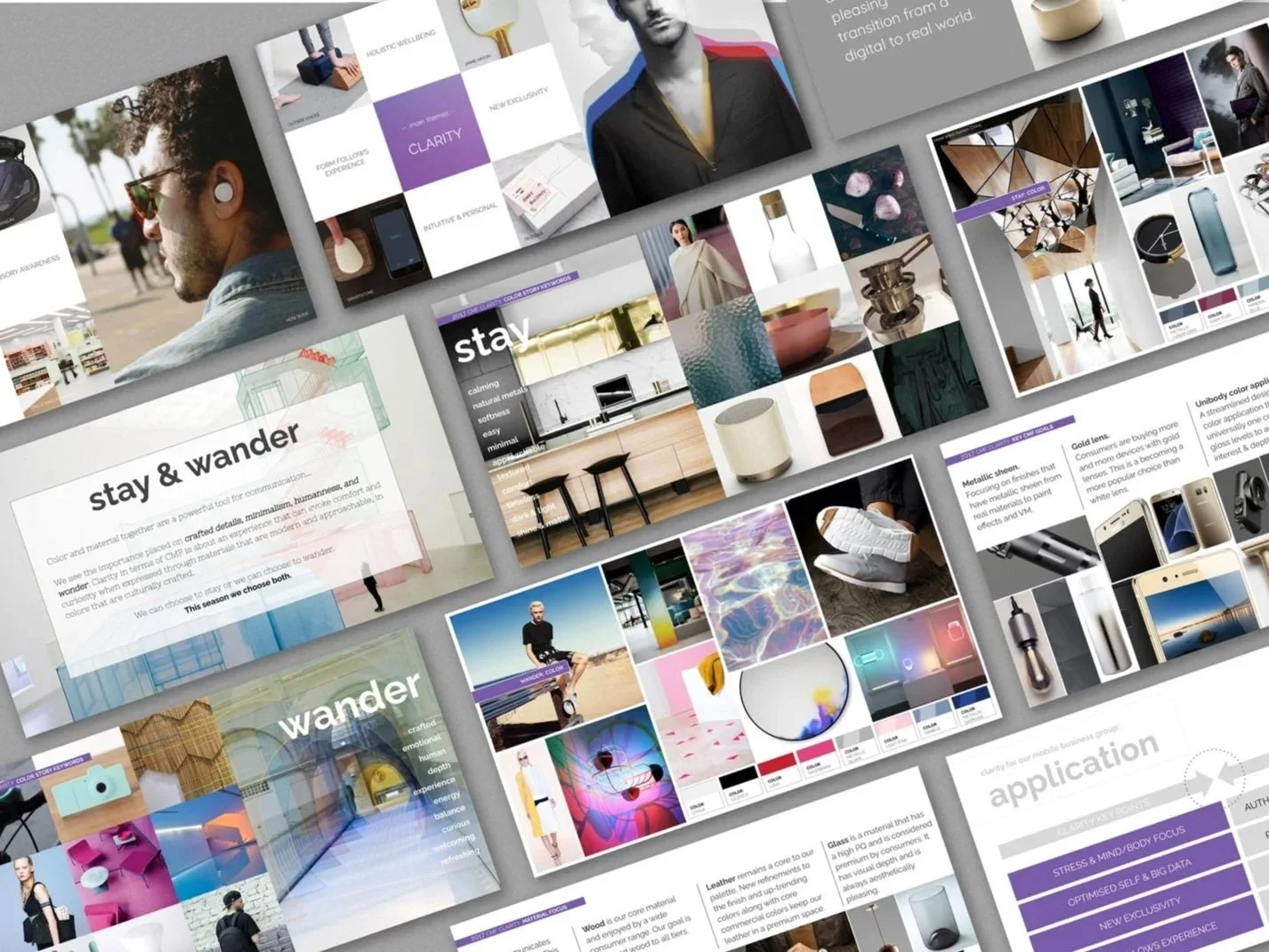
Clarity strategy presentation, rendered in context to show the research, trend, and CMF insights guiding long-term portfolio direction.
Context
Clarity was a multi-month design strategy initiative focused on defining long-term color, material, and finish (CMF) direction across the portfolio. The project combined consumer research, trend projection, and market analysis to establish a shared foundation for exploration, palette development, and future product expression.
Goal
The goal was to establish a cohesive, forward-looking CMF framework that balances brand identity, consumer preference, and emerging design trends—providing a clear strategic foundation to guide exploration, palette development, and portfolio evolution over time.
Role & Responsibilities
Clarity was developed as a collaborative CMF team effort. My primary responsibilities included:
Ownership of image and color reference development across all phases of the project
Presentation structure and visual narrative, shaping how research, trends, and themes were communicated
On-site manufacturing color matching in China, aligning CMF palette sample chips for studio and development use
Contribution to strategy synthesis in collaboration with the broader CMF team
This role bridged strategy, communication, and physical execution—ensuring conceptual direction translated accurately into tangible CMF references.
Approach
Months of consumer research and trend analysis informed the foundation of Clarity. Research outputs included material-focused insights, technology-driven behavior shifts, and innovation drivers shaping future CMF opportunities.
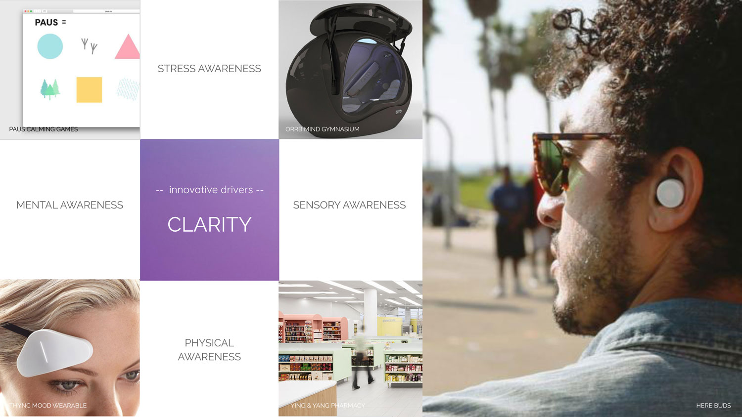
Research summaries identifying key themes and innovation drivers for the portfolio
Technology and lifestyle trends informing consumer expectations and CMF opportunities
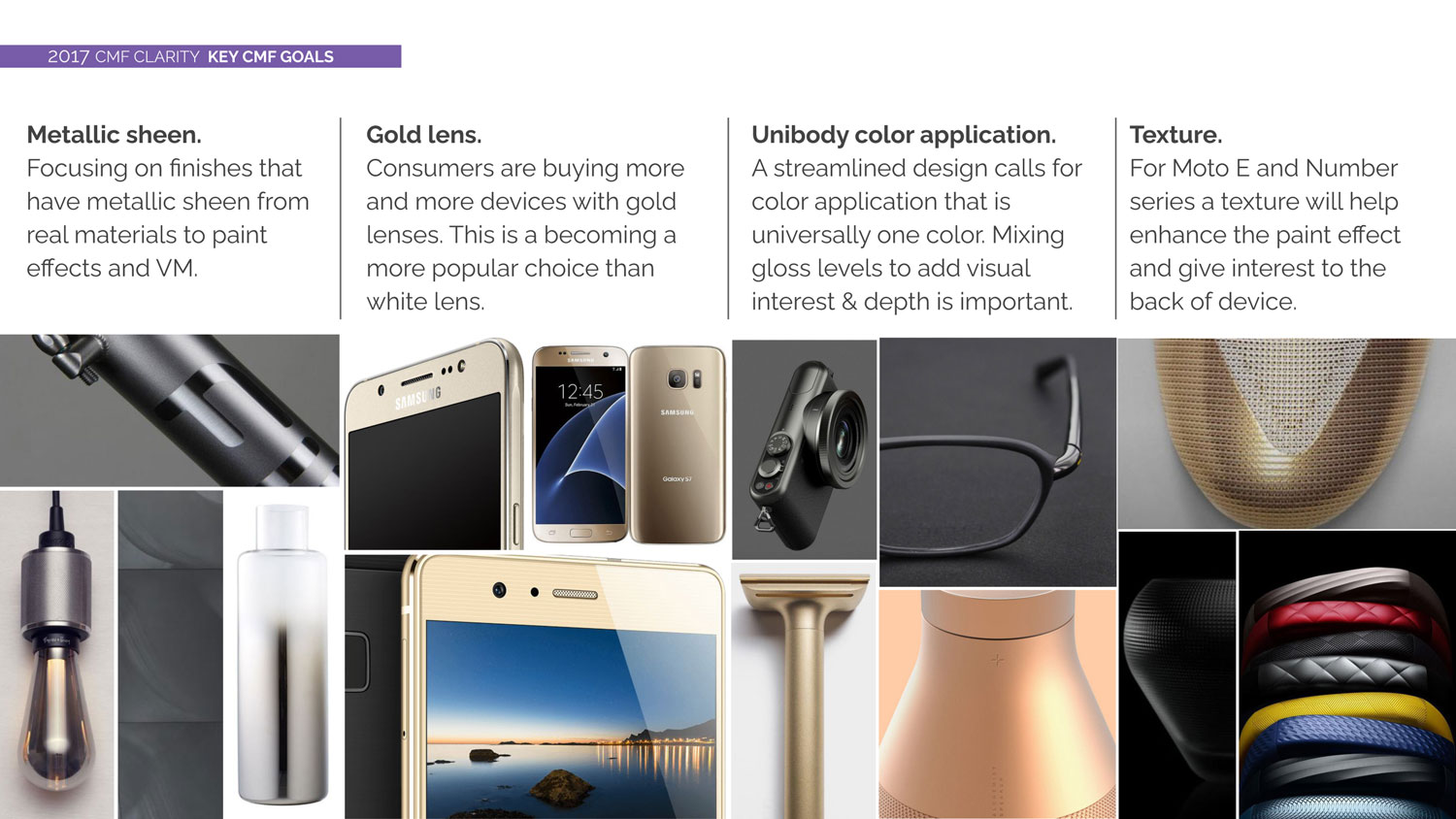
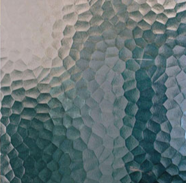
Materials-focused insights shaping palette and surface strategies
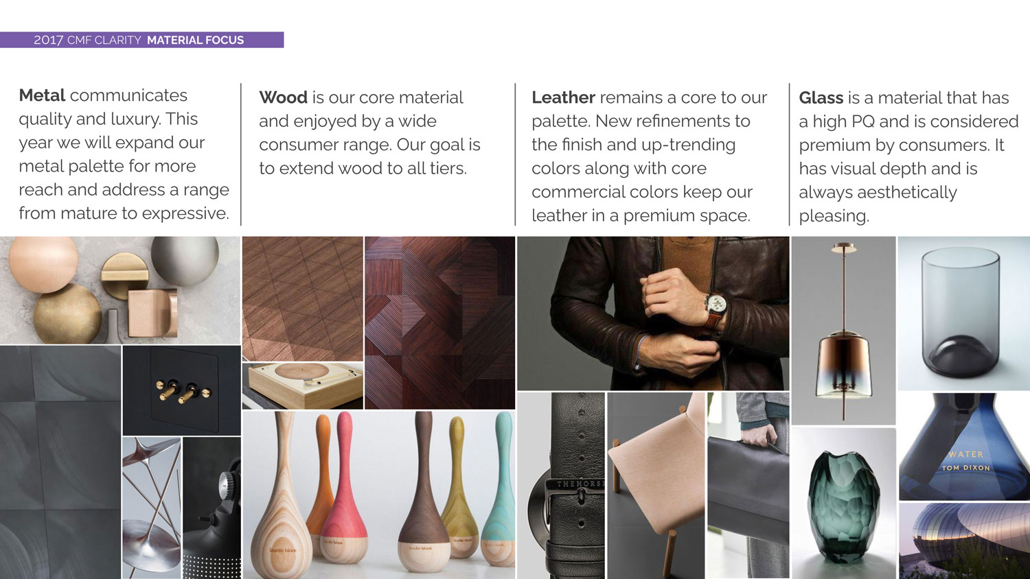
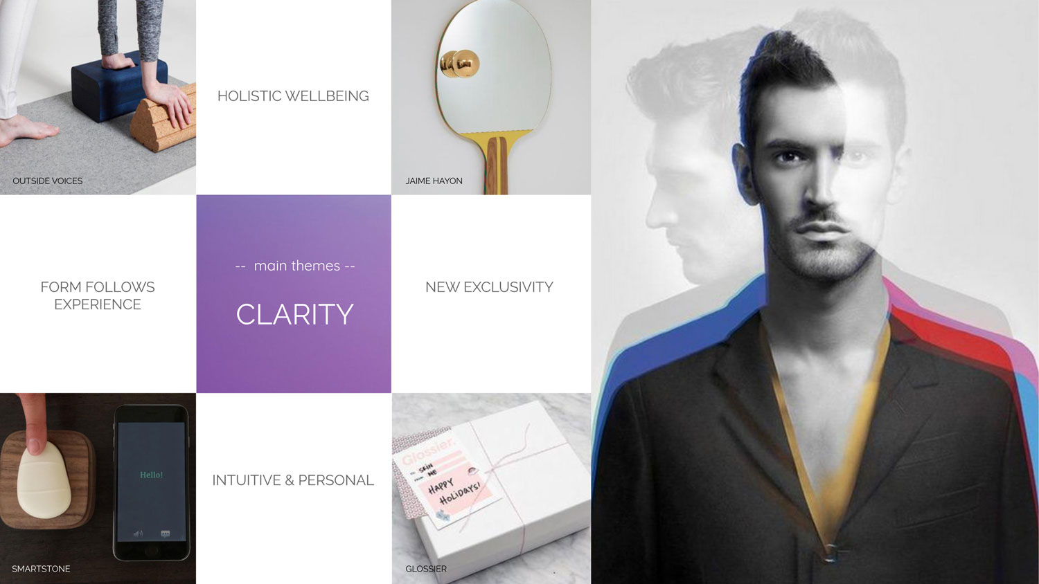
Two strategic themes—Stay and Wander—were defined to translate research insights into clear design intent. Each theme combined visual inspiration, keywords, and targeted color exploration to support both emotional and functional CMF decision-making.
Themes & Exploration
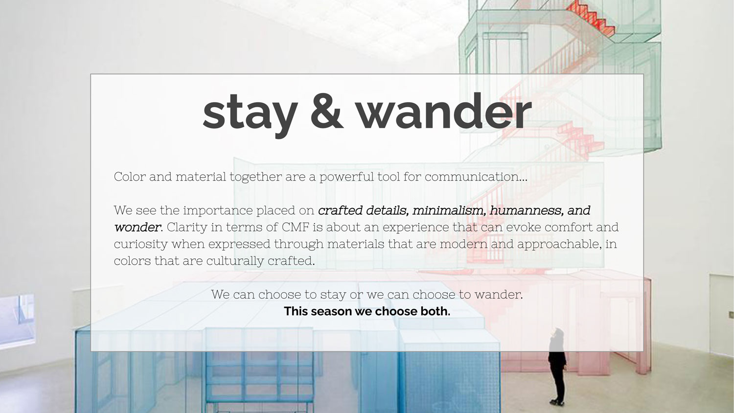

Comfort and curiosity, this season we choose both.
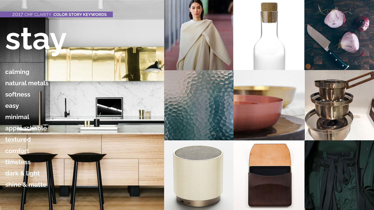
Fine Gold
Metallic Bronze
Blush Gold
Dark Topaz
Light Pink
Raspberry
Metallic Silver
Lava
Rose Gold
Metallic Lunar Gray
Dark Ruby
Mineral Blue
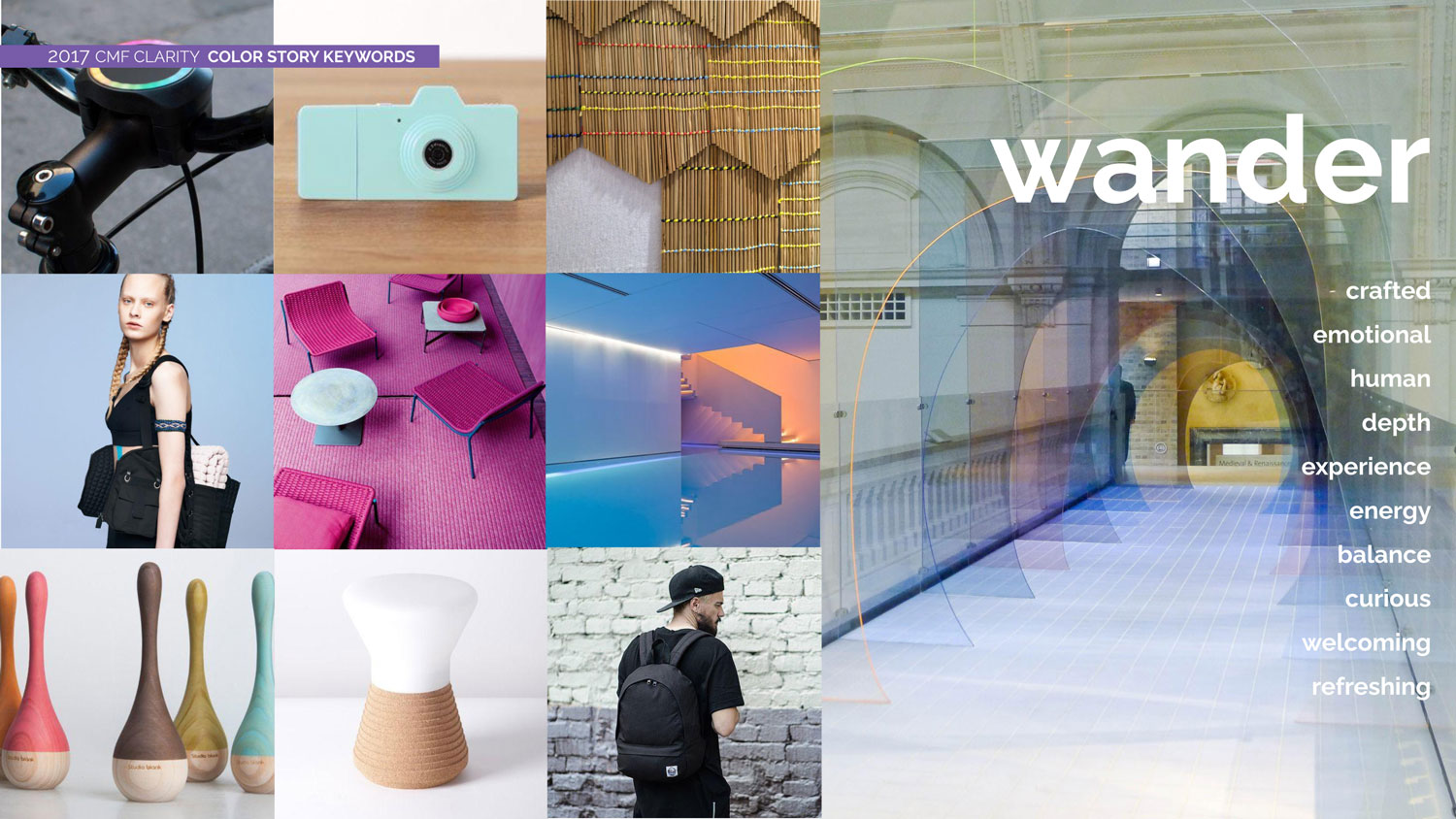
Licorice
Chalk
Nimbus
Metallic Sapphire
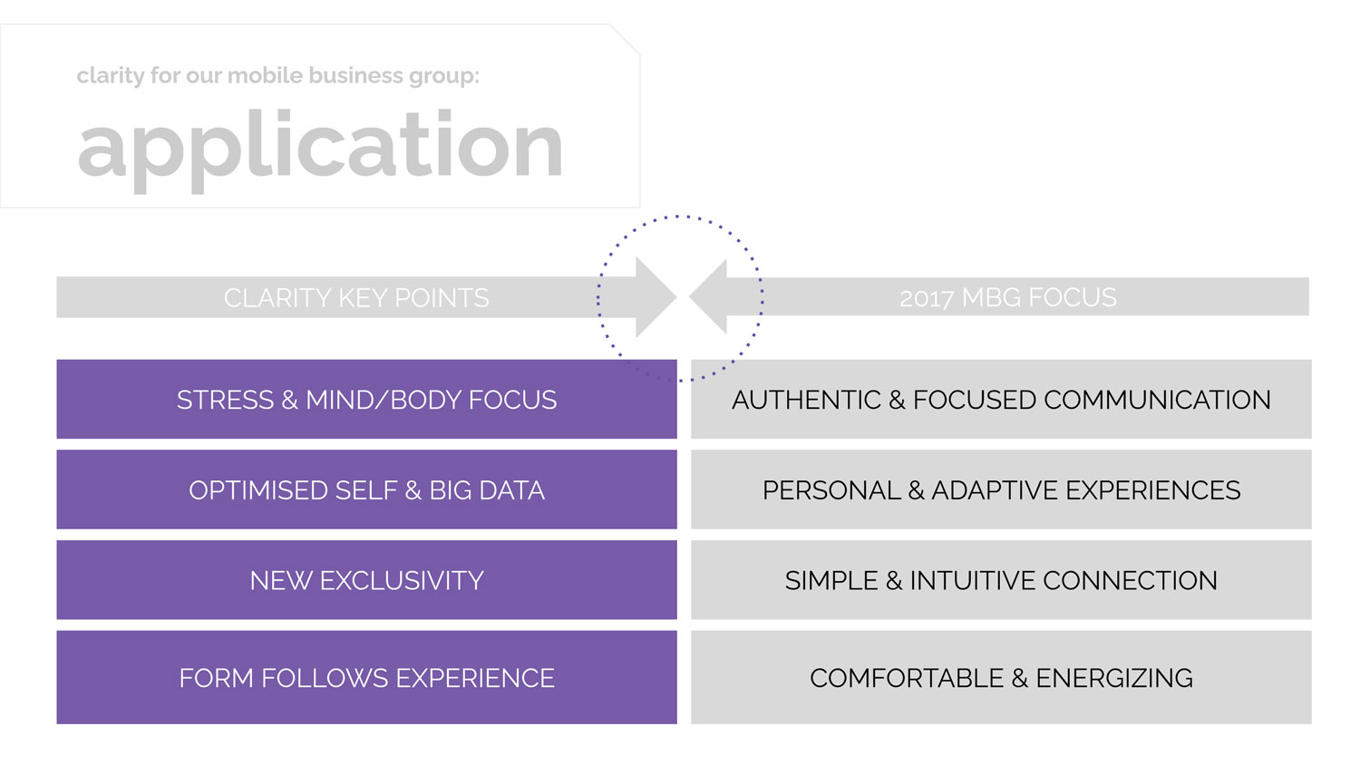
Strategic Translation
Key insights from research and theme exploration were synthesized into a framework connecting Clarity’s core principles to specific design initiatives and focus areas—supporting consistency while enabling evolution.
Framework translating research insights into focused CMF design initiatives.
From Strategy to Physical Reference
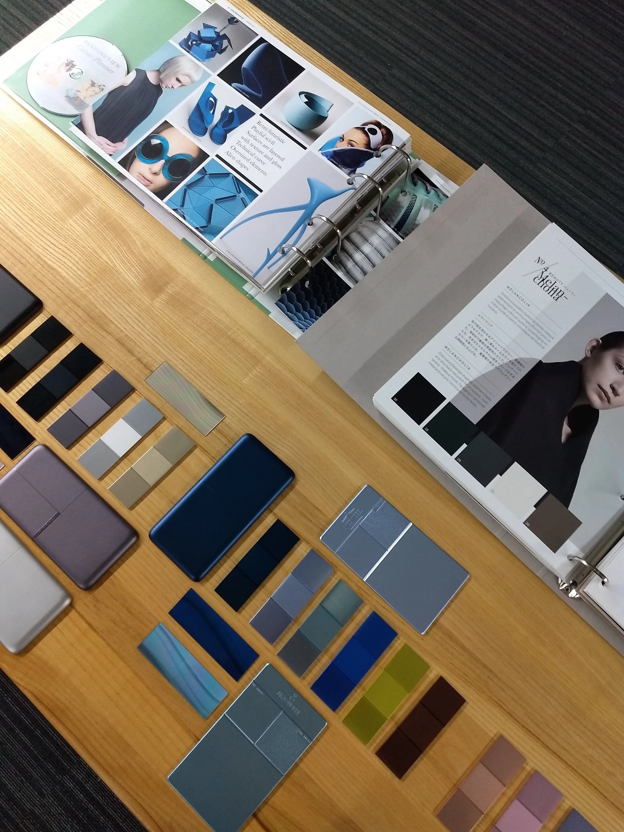
To ensure strategic intent translated into real-world execution, physical CMF references were developed and reviewed. This included early planning for a CMF living wall and hands-on review of target material and color chips.
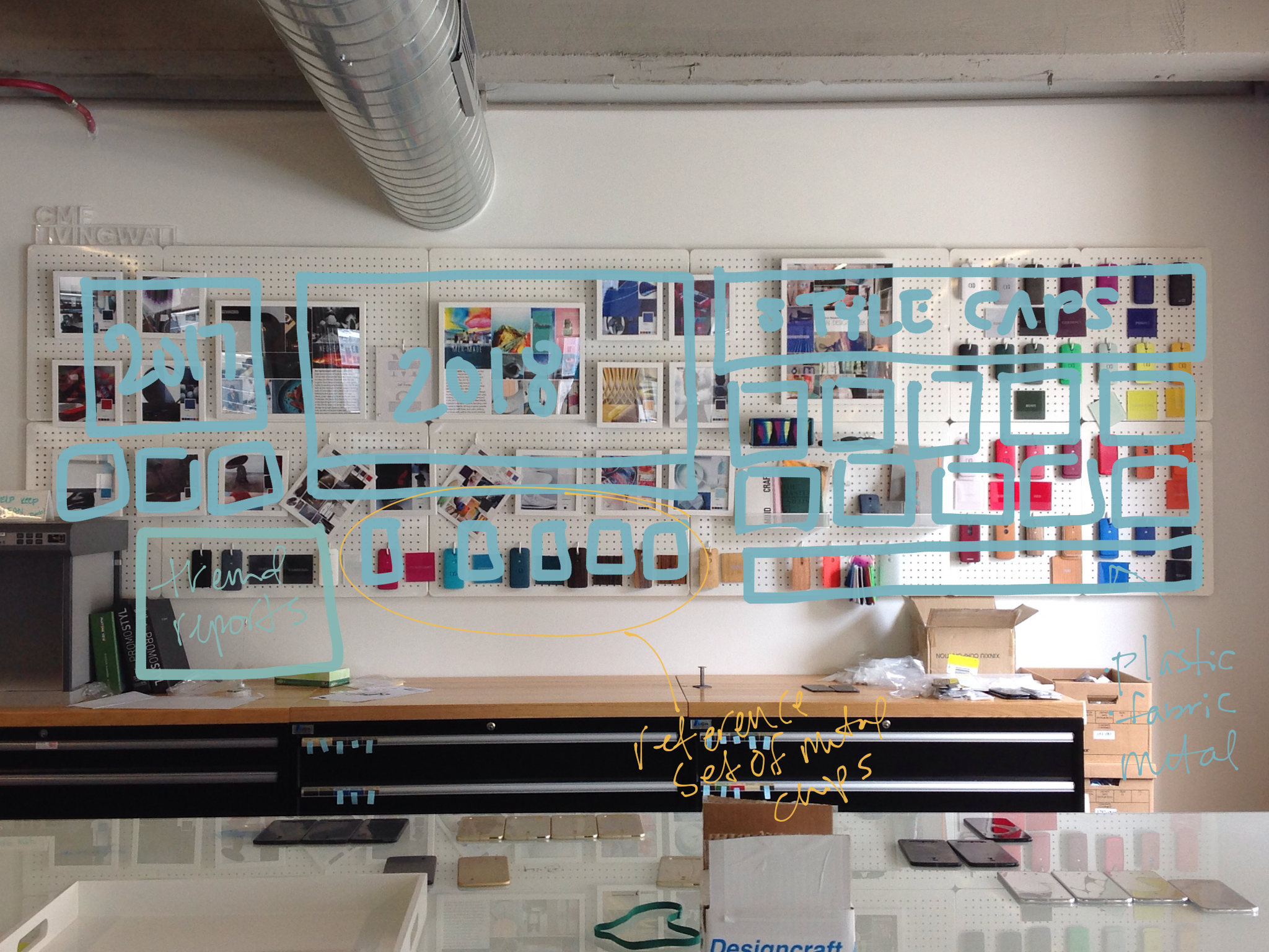
CMF living wall concept sketch
Material and color chip review on table
Reflection
The importance of a shared understanding.
Clarity reinforced the importance of treating CMF strategy as both analytical and tangible. By connecting research, narrative, and physical reference, the project established a shared language that could guide exploration today while remaining flexible for future evolution.